![[Part 2] Frontend: Intermediate html/css/js](https://images.unsplash.com/photo-1669023414166-a4cc7c0fe1f5?crop=entropy&cs=tinysrgb&fit=max&fm=jpg&ixid=M3wxMTc3M3wwfDF8c2VhcmNofDR8fGh0bWx8ZW58MHx8fHwxNzUwNDkwMzI4fDA&ixlib=rb-4.1.0&q=80&w=1920)
HTML 5.0
มาตรฐานของภาษา HTML มีการจัดโครงสร้างและการแสดงผลของเนื้อหาสำหรับ www มาตรฐานใหม่มีคุณลักษณะเด่นที่สำคัญ ตัวอย่าง เช่น
- เล่นวิดีโอ
- แสดงตำแหน่งทางภูมิศาสตร์
- เก็บไฟล์ในลักษณะออฟไลน์
- แสดงกราฟิก
- การป้อนข้อมูลแบบใหม่ เช่น search, number, range, color, tel, url, email, date, month, week, time, datetime, datetime-local
มาตรฐาน HTML 5
<!DOCTYPE html>มาตรฐาน HTML 4.01
<!DOCTYPE HTML PUBLIC "-//W3C//DTD HTML 4.01 Transitional//EN" ">มาตรฐาน XHTML 1.1
<!DOCTYPE html PUBLIC "-//W3C//DTD XHTML 1.1//EN" "">กำหนดรูปแบบ Character encoding ในหน้าเว็บ
การกำหนดรูปแบบการเข้ารหัสอักขระ(Character encoding) โดยใช้แท็ก<meta> กำหนด Attribute charset ลงไป
<meta charset="utf-8">
<meta http-equiv="Content-Type" content="text/html; charset=utf-8">
Comment
<!-- ข้อความอธิบายโค้ด -->Head Tag
meta: charset: กำหนด encoding ของเว็บให้อ่านภาษาไทยได้
<meta charset="UTF-8">meta: viewport: กำหนดการแสดงผลให้รองรับ device ต่างๆ
<meta name="viewport" content="width=device-width, initial-scale=1.0">meta: description: กำหนดข้อความให้ SEO อ่านเจอ
<meta name="description" content="เว็บตัวอย่างสำหรับฝึกเขียน HTML CSS JS">link: icon: ใช้กำหนด icon ใน tab browser
<link rel="icon" href="favicon.ico">Example
<head>
  <meta charset="UTF-8">
  <meta name="viewport" content="width=device-width, initial-scale=1.0">
  <meta name="description" content="เว็บไซต์ฝึกเขียน HTML CSS JavaScript">
  <title>My First Web</title>
  <link rel="stylesheet" href="styles.css">
  <link rel="icon" href="favicon.ico">
  <script src="app.js" defer></script>
</head>
Semantic Tag
การใช้ Semantic tag ถูกนำมาใช้แทน div หลายๆชั้นในหน้าเว็บจะส่งผลทำให้โครงสร้าง html มีความหมายตรงตัวชัดเจนมากยิ่งขึ้น
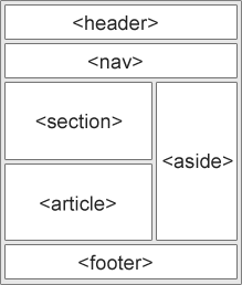
<header>คือ ส่วนหัวของเว็บ<nav>คือ เมนูของเว็บ หรือ ลิงค์ไปเว็บอื่นๆ<article>คือ ส่วนที่แสดงเนื้อหาของเว็บ<section>คือ กลุ่มหัวข้อย่อย<aside>คือ เนื้อหาอื่นๆที่แยกจากเนื้อหาหลัก<footer>คือ ส่วนท้ายของหน้าเว็บ
Example
<!DOCTYPE html>
<html lang="th">
<head>
<meta charset="UTF-8">
<title>เว็บไซต์ตัวอย่าง - Semantic HTML</title>
</head>
<body>
<!-- ส่วนหัวของเว็บ -->
<header>
<h1>ยินดีต้อนรับสู่เว็บไซต์ของฉัน</h1>
</header>
<!-- เมนูนำทาง -->
<nav>
<ul>
<li><a href="#home">หน้าแรก</a></li>
<li><a href="#about">เกี่ยวกับเรา</a></li>
<li><a href="#contact">ติดต่อ</a></li>
</ul>
</nav>
<!-- เนื้อหาหลัก -->
<article>
<h2 id="home">หน้าแรก</h2>
<p>นี่คือเนื้อหาหลักของเว็บไซต์</p>
<!-- กลุ่มหัวข้อย่อย -->
<section id="about">
<h3>เกี่ยวกับเรา</h3>
<p>เราคือเว็บไซต์ตัวอย่างสำหรับการสอน HTML</p>
</section>
<section id="contact">
<h3>ติดต่อเรา</h3>
<p>อีเมล: example@example.com</p>
</section>
</article>
<!-- เนื้อหาที่ไม่ใช่เนื้อหาหลัก -->
<aside>
<h4>บทความแนะนำ</h4>
<ul>
<li><a href="#">การเขียน HTML เบื้องต้น</a></li>
<li><a href="#">การใช้ CSS จัดหน้า</a></li>
</ul>
</aside>
<!-- ส่วนท้ายของเว็บ -->
<footer>
<p>© 2025 เว็บไซต์ตัวอย่าง</p>
</footer>
</body>
</html>HTML FORM
การพัฒนาเว็บจำเป็นต้องมีการสร้างแบบฟอร์มที่ผู้ใช้งานสามารถป้อนข้อมูลต่างๆได้ เพื่อนำข้อมูลที่ป้อนนั้นไปทำการประมวลผลอีกทีโดยการรับค่าข้อมูลจะดำเนินการผ่าน <form>….</form>
<input>สร้างช่องรับข้อความต่างๆ<select>แสดงตัวเลือกในรูปแบบ Drop-down<option>สร้างตัวเลือก<button>สร้างปุ่ม<label>กำหนดป้ายชื่อให้ช่องรับข้อมูล<textarea>สร้างช่องรับข้อความแบบหลายบรรทัด
Example
<!DOCTYPE html>
<html lang="th">
<head>
  <meta charset="UTF-8">
  <title>แบบฟอร์มตัวอย่าง</title>
</head>
<body>

  <h1>ฟอร์มสมัครสมาชิก</h1>

  <form action="/submit" method="post">

    <!-- label + input -->
    <label for="username">ชื่อผู้ใช้:</label>
    <input type="text" id="username" name="username" required>
    <br><br>

    <!-- label + input (password) -->
    <label for="password">รหัสผ่าน:</label>
    <input type="password" id="password" name="password" required>
    <br><br>

    <!-- label + select + option -->
    <label for="gender">เพศ:</label>
    <select id="gender" name="gender">
      <option value="male">ชาย</option>
      <option value="female">หญิง</option>
      <option value="other">อื่นๆ</option>
    </select>
    <br><br>

    <!-- label + textarea -->
    <label for="about">เกี่ยวกับคุณ:</label><br>
    <textarea id="about" name="about" rows="4" cols="50" placeholder="เขียนแนะนำตัวสั้นๆ..."></textarea>
    <br><br>

    <!-- button -->
    <button type="submit">ส่งข้อมูล</button>

  </form>

</body>
</html>
CSS: Flexbox และ Grid
Flexbox
เป็นรูปแบบหนึ่งของ CSS ที่ช่วยให้เราจัด layout ของ element ได้ง่ายขึ้น โดยเฉพาะการจัดเรียงในแนวนอน (row) หรือแนวตั้ง (column) ให้ยืดหยุ่นตามขนาดหน้าจอ การใช้งานเต็มๆ: https://css-tricks.com/snippets/css/a-guide-to-flexbox/
Example
<!DOCTYPE html>
<html lang="th">

<head>
  <meta charset="UTF-8">
  <title>CSS Flexbox & Grid</title>
  <style>
    .container {
      display: flex;
      justify-content: space-between;
      align-items: center;
    }

    .item {
      padding: 5px;
      margin: 5px;
      background-color: lightblue;
      border: 1px solid #333;
      width: 100%;
    }

    .inner-flex {
      display: flex;
      justify-items: flex-end;
      flex-direction: column-reverse;
    }

    .inner-item {
      margin: 5px;
      border: 1px solid red;
    }

    .long-flex {
      flex: 3;
    }

    .short-flex {
      flex: 1;
    }
  </style>
</head>

<body>
  <div class="container">
    <div class="item inner-flex long-flex">
      <div class="inner-item">
        Inner Box 1
      </div>
      <div class="inner-item">
        Inner Box 2
      </div>
    </div>
    <div class="item short-flex">Box 2</div>
    <div class="item short-flex">Box 3</div>
  </div>
</body>

</html>
Grid
ระบบจัด layout ที่ช่วยให้เราสามารถสร้างโครงร่างหน้าเว็บหรือกล่องข้อมูลในรูปแบบตาราง (row + column) ได้ง่ายและยืดหยุ่นมากกว่าเดิม ข้อมูลเพิ่มเติม: https://css-tricks.com/snippets/css/complete-guide-grid/
Example
<!DOCTYPE html>
<html lang="th">

<head>
  <meta charset="UTF-8">
  <title>CSS Flexbox & Grid</title>
  <style>
    .grid-container {
      display: grid;
      grid-template-columns: 100px 100px 100px;
      grid-gap: 10px;
    }

    .grid-item {
      background-color: lightblue;
      padding: 20px;
      text-align: center;
    }
  </style>
</head>

<body>
  <div class="grid-container">
    <div class="grid-item">1</div>
    <div class="grid-item">2</div>
    <div class="grid-item">3</div>
    <div class="grid-item">4</div>
  </div>
</body>

</html>
Bootstrap layout
Bootstrap มีเครื่องมือที่ช่วยให้สร้าง layout ได้ง่ายและ responsive (รองรับทุกขนาดหน้าจอ) โดยใช้ Grid System + class ต่างๆ ที่เตรียมมาให้ รายละเอียดเพิ่มเติม: https://getbootstrap.com/docs/4.0/layout/grid/
แนวคิดของ Bootstrap Grid
ใช้ container เป็นตัวห่อ layout ทั้งหมด
- แบ่งหน้าเว็บเป็น row (แถว)
- แต่ละ row แบ่งออกเป็น 12 columns
- ใช้ class เช่น
col-,col-md-,col-lg-เพื่อกำหนดขนาด column ตามขนาดจอ
Example
<!DOCTYPE html>
<html lang="th">

<head>
  <meta charset="UTF-8">
  <title>Bootstrap Layout Example</title>
  <link href="https://cdn.jsdelivr.net/npm/bootstrap@5.3.0/dist/css/bootstrap.min.css" rel="stylesheet">
</head>

<body>
  <div class="container">
    <div class="row">
      <div class="col-4">
        <div class="p-3 bg-success text-white">คอนเทนต์ 1</div>
      </div>
      <div class="col-2">
        <div class="p-3 bg-warning text-white">คอนเทนต์ 2</div>
      </div>
    </div>
  </div>
</body>

</html>
Responsive design
เป็นการออกแบบหน้าจอให้เว็บแสดงผลได้ดีทั้งมือถือ แท็บเล็ต เดสก์ท็อป
- CSS Media queries
@media (max-width: 768px) {
  h1 {
    font-size: 20px;
  }
}
ถ้าหน้าจอกว้างไม่เกิน 768px ให้ h1 ขนาดเล็กลง
- Bootstrap Responsive grid system
<div class="row">
  <div class="col-md-6 col-sm-12">ครึ่งจอใน desktop เต็มจอในมือถือ</div>
  <div class="col-md-6 col-sm-12">ครึ่งจอใน desktop เต็มจอในมือถือ</div>
</div>
JQuery
jQuery เป็น JavaScript library ที่ช่วยให้การเขียน JavaScript ง่ายขึ้น ช่วยลดความซับซ้อนของการจัดการ DOM, Event, Animation และ AJAX นอกจากนี้ jQuery ยังมี Syntax ที่กระชับ อ่านง่าย ใช้งานได้กับ browser ทุกรุ่น [reference: https://jquery.com/]
การใช้งาน jQuery
import script โดยใช้
<script src="https://code.jquery.com/jquery-3.6.0.min.js"></script>Syntax jQuery
$(selector).action();selector→ เลือก element (คล้าย CSS)action→ สิ่งที่ต้องการทำ (เช่น ซ่อน, คลิก, เปลี่ยนค่า)
การใช้งาน
- เลือก element
$("#id")        // เลือก element ตาม id
$(".class")     // เลือก element ตาม class
$("tagname") // เลือก element ตาม tag- จัดการ event
<button id="btn">คลิกฉัน</button>
<p id="message">ข้อความเดิม</p>

<script>
  $("#btn").click(function() {
    $("#message").text("คุณคลิกแล้ว!");
  });
</script>- แสดง/ซ่อน element
<p id="text">ข้อความที่สามารถซ่อนได้</p>
<button id="hideBtn">ซ่อน</button>
<button id="showBtn">แสดง</button>

<script>
  $("#hideBtn").click(function() {
    $("#text").hide();
  });

  $("#showBtn").click(function() {
    $("#text").show();
  });
</script>- Force เปลี่ยน style css
$("#btn").click(function() {
  $("#text").css("color", "red");
});- Animation
$("#btn").click(function() {
  $("#box").fadeOut(1000);  // ค่อยๆ หายไปใน 1 วินาที
});- Load ข้อมูลจาก Backend
<!DOCTYPE html>
<html lang="th">

<head>
  <meta charset="UTF-8">
  <title>jQuery Example</title>
  <script src="https://code.jquery.com/jquery-3.6.0.min.js"></script>
</head>

<body>
  <h2>All currency</h2>
  <div id="data"></div>
  <script>
    $.get("https://cdn.jsdelivr.net/npm/@fawazahmed0/currency-api@latest/v1/currencies.json", function (currencies) {
      for (let currency in currencies) {
        $('#data').append(`<p>Symbol: ${currency}, Currency: ${currencies[currency]}</p>`)
      }
    });
  </script>
</body>

</html>
Reference
 Chris Coyier
 Chris House
 Mark Otto, Jacob Thornton, and Bootstrap contributors
 OpenJS Foundation - openjsf.org

![[Part 5] Frontend: Scaling Vue.js EP2](https://images.unsplash.com/photo-1653387137517-fbc54d488ed8?crop=entropy&cs=tinysrgb&fit=max&fm=jpg&ixid=M3wxMTc3M3wwfDF8c2VhcmNofDF8fHZ1ZXxlbnwwfHx8fDE3NTE3MDk3Nzl8MA&ixlib=rb-4.1.0&q=80&w=1140)
![[Part 4] Frontend: Scaling Vue.js EP.1](https://images.unsplash.com/photo-1607799279861-4dd421887fb3?crop=entropy&cs=tinysrgb&fit=max&fm=jpg&ixid=M3wxMTc3M3wwfDF8c2VhcmNofDF8fHZ1ZS5qc3xlbnwwfHx8fDE3NTExMzMwNDJ8MA&ixlib=rb-4.1.0&q=80&w=1140)
![[Part 3] Frontend: Modern Framework + Vue.js 3](https://images.unsplash.com/photo-1585076641399-5c06d1b3365f?crop=entropy&cs=tinysrgb&fit=max&fm=jpg&ixid=M3wxMTc3M3wwfDF8c2VhcmNofDN8fGpxdWVyeXxlbnwwfHx8fDE3NTA5NDYzMDl8MA&ixlib=rb-4.1.0&q=80&w=1140)